
Branding
2023
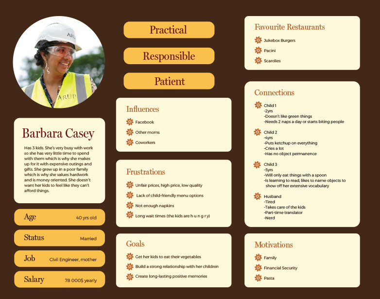
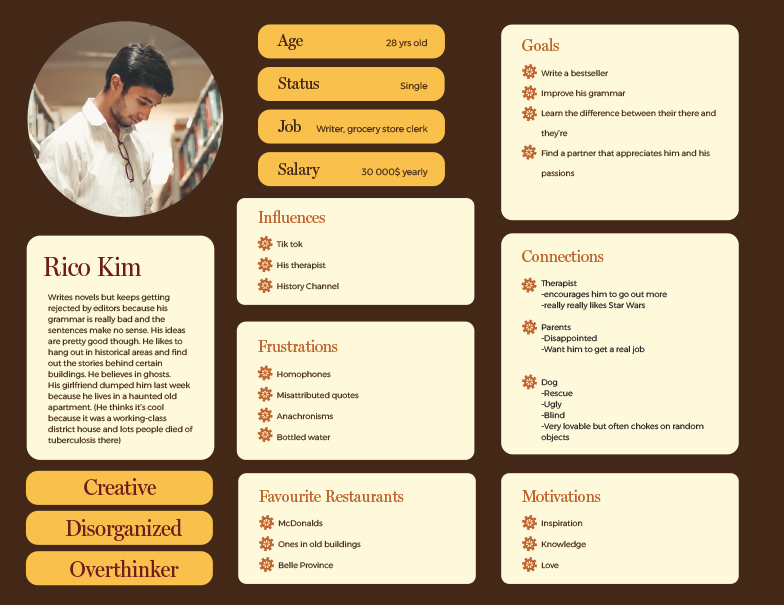
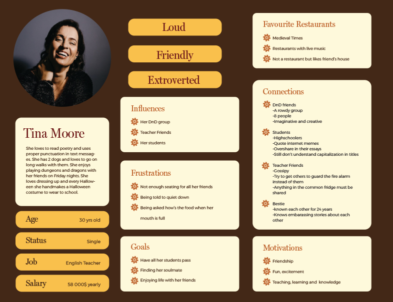
Restaurant Automate is a business I invented for my design studio class. This restaurant has a steampunk aesthetic and uses machinery to take orders and bring them to tables. I made a persona booklet to identify the type of diners the restaurant would attract as well as help us picture who I’m designing for. I made a cool business card, an infographic, a kids’ menu and a simple website.
Programs used
Illustrator
Photoshop
Dreamweaver
Restaurant Automate Branding
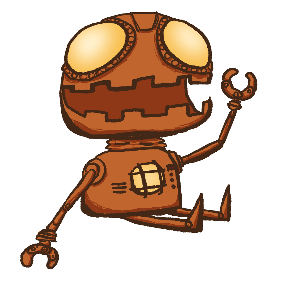
1. Vibe
This branding project lasted for the whole semester and I made multiple different designs for the same restaurant. The first thing I did when I received this project was to come up with my concept for the restaurant.
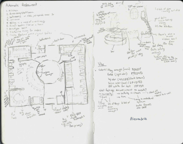
I first sketched out the restaurant layout. This helps me visualize what it could look like and gives me a better idea of its looks and atmosphere. This helps me forge a strong identity for Automate in my head. The real life equivalent would be visiting the restaurant to see what values, colours and energy it gives off.

Next, I found a colour palette I liked. I wanted something warm but also metallic/industrial looking. I chose saturated oranges, gold and browns to give the restaurant a warm and homey feel like a fire pit but while also keeping realistic(ish) metal colours.
2. Logo
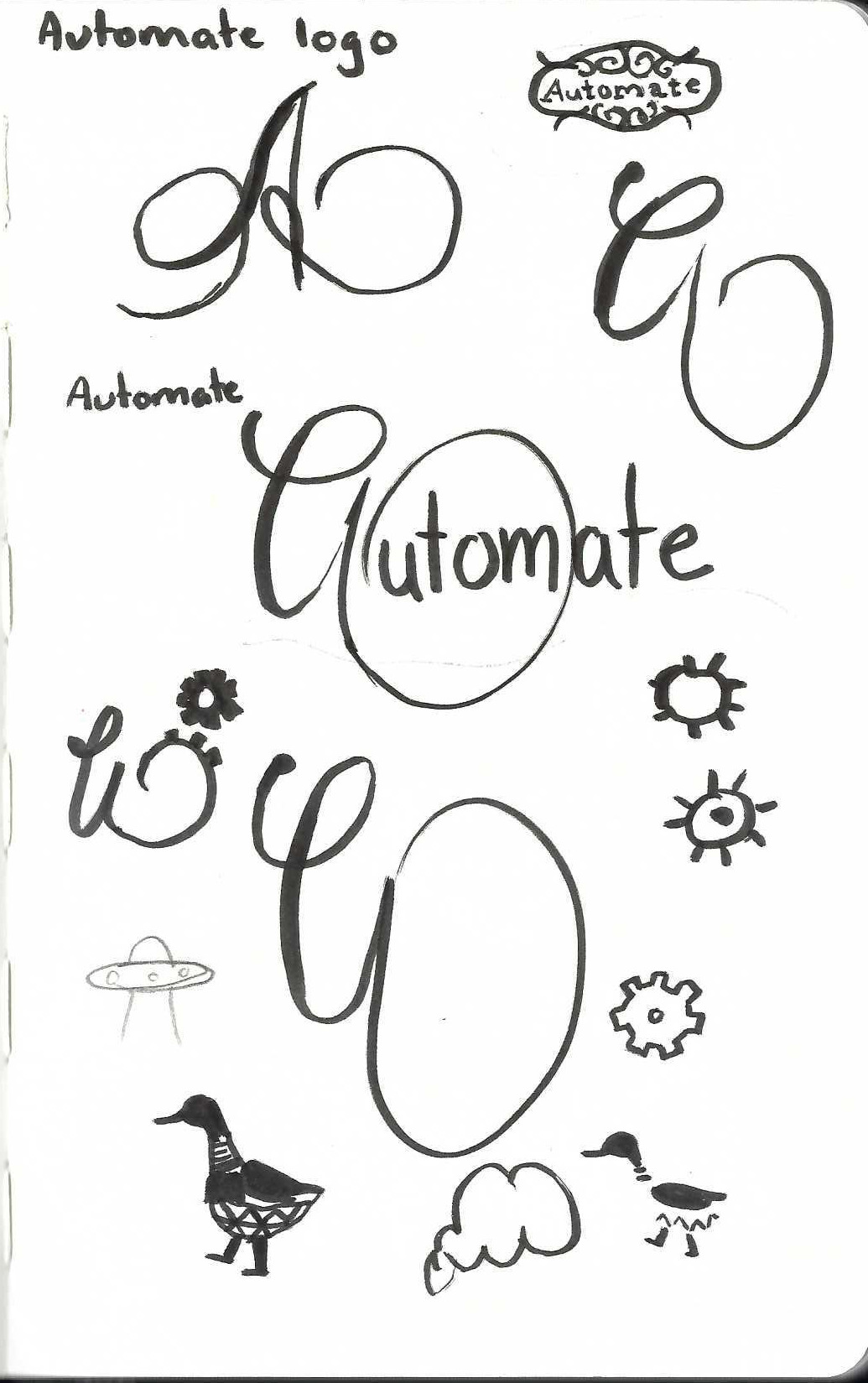
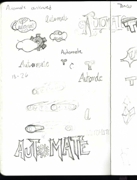
I sketched out a few logo ideas, some more successful than others. I played a bit with the idea of the Canard de Vaucanson but thought that reference might be a bit too obscure and that one doesn’t really immediately think of ducks when faced with the word automate.

3. Business Cards
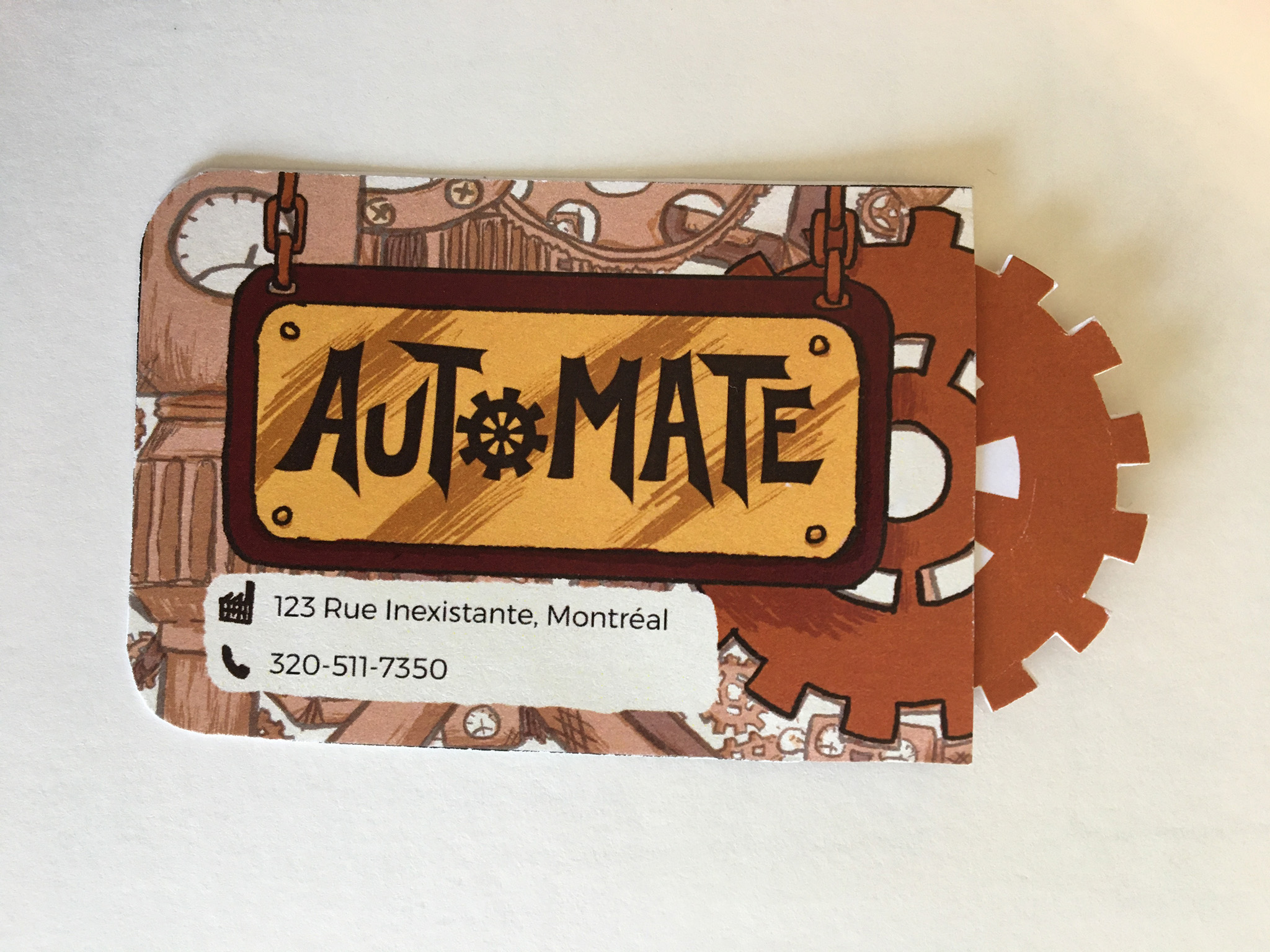
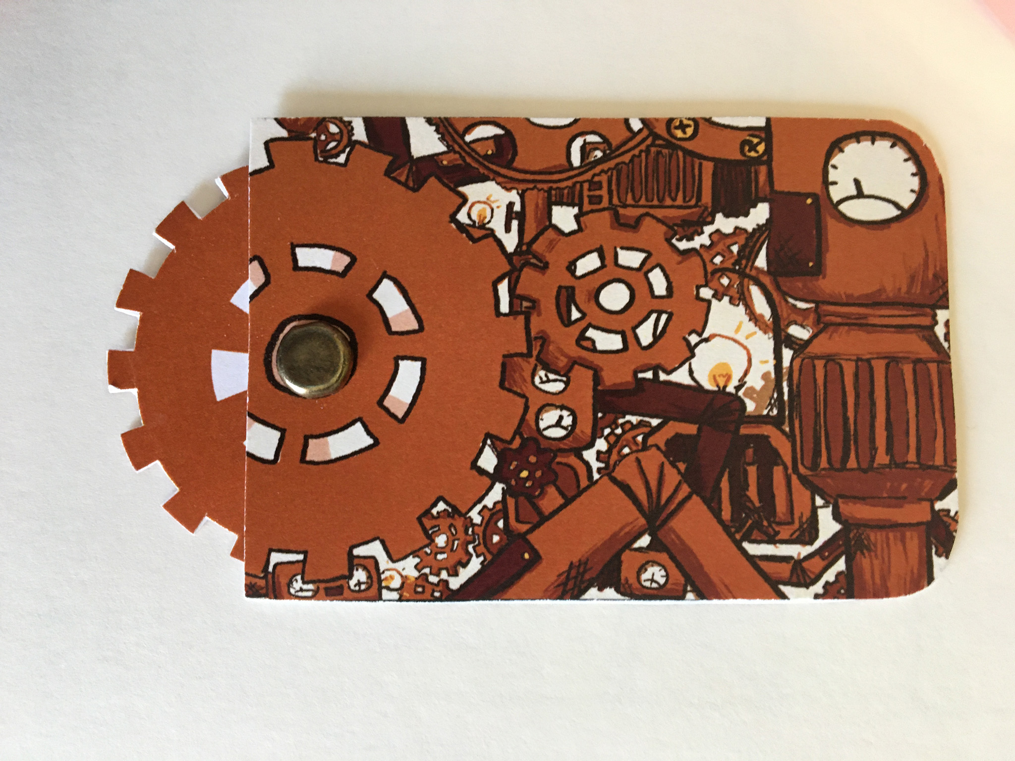
Once again, I start every project with some rough sketches. I juggled with three ideas. I either wanted a complex design with lots of lines to resemble wires, an old train ticket with the restaurant’s information on it or an interactive business card where the cog would spin. Since I only had to make 1 business card and wouldn’t have to cut out hundreds of cogs, I went for that idea. I thought it would make the card memorable and make people less likely to throw it out.
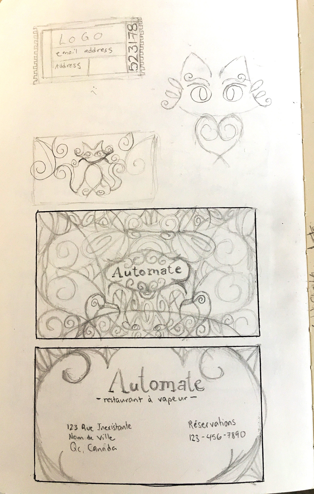
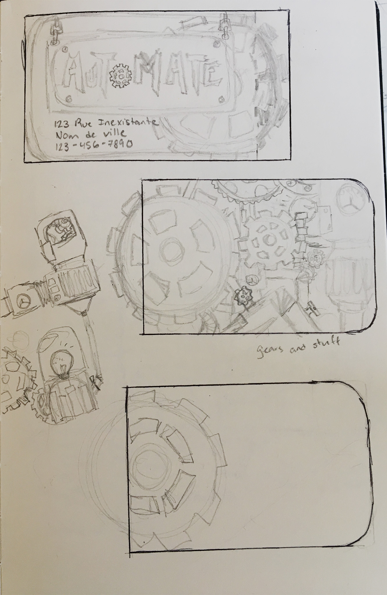
I made the sketch in illustrator then moved to photoshop to draw it. I wanted a rough, hand-drawn look so I chose my favourite brush (Kyle’s Inkbox Classic Cartoonist).
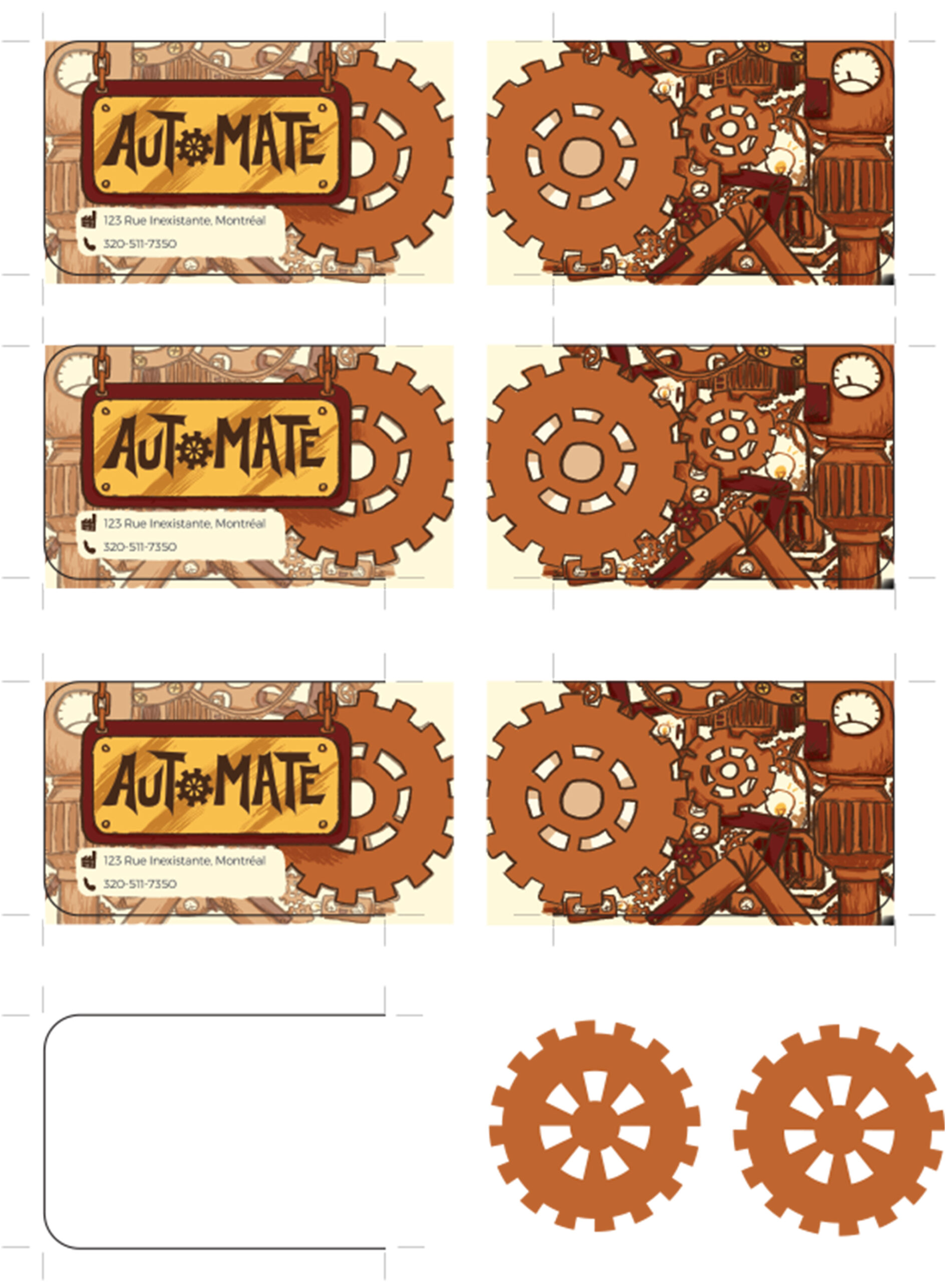
I did not print the cards back to back because they would require some crafting skills to assemble. I glue three sides and left one separated to form a little pouch. After a struggle cutting out each individual indent on the cog, I punched a hole through the middle and assembled my card.
4. Personas Booklet
The persona booklet simply helps businesses visualize their target audience. I created three people and explained who they were with a simple layout using Automate’s branding.
5. Infographics
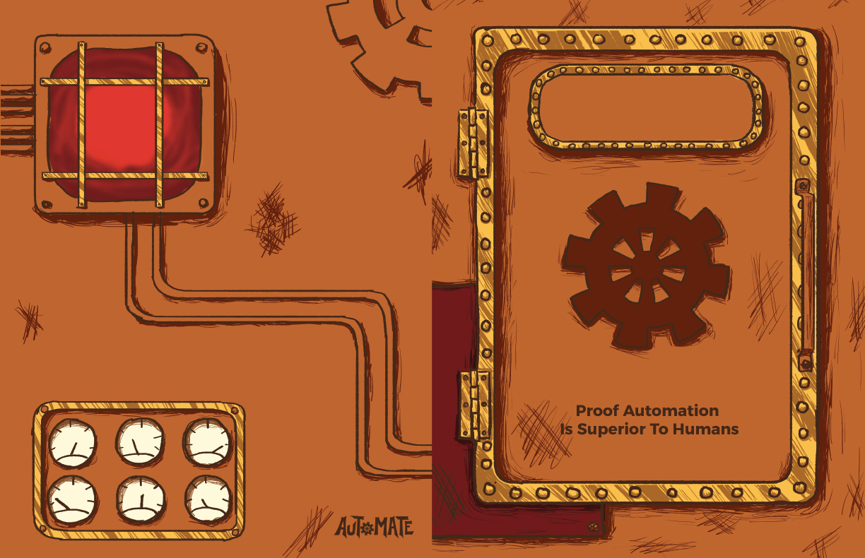
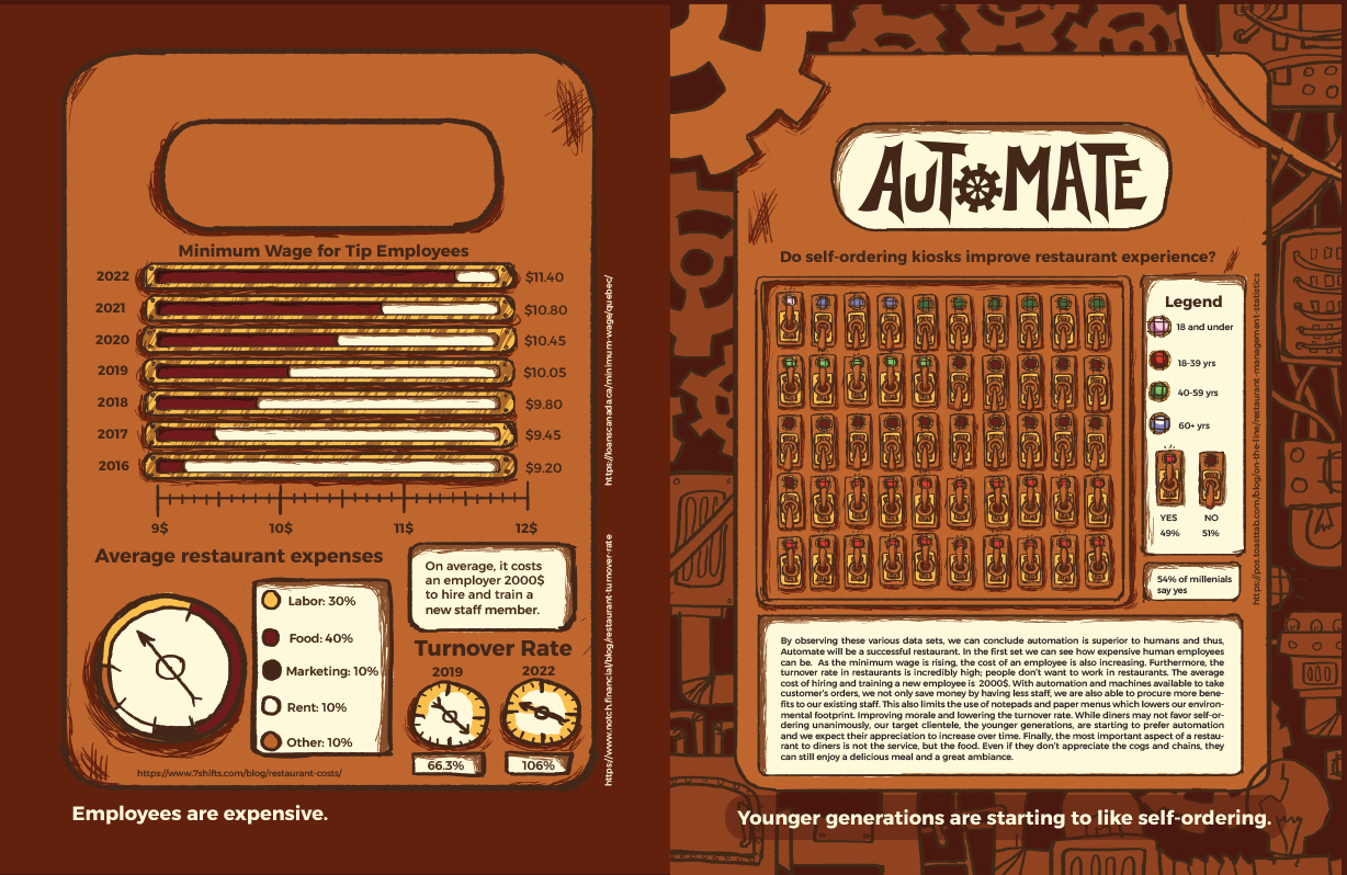
For this project we had to create infographics explaining how our restaurant could be successful. I chose to focus on the restaurant’s use of robots and machinery to take orders, and deliver food.
My final infographic was a booklet with a window cut out through it.
6. Kids’ Menu
I decided to make the kid’s menu a placemat that they could draw on. I made some little games to keep them entertained. I wanted Automate to be a family friendly restaurant so an interesting kids’ menu is a must!
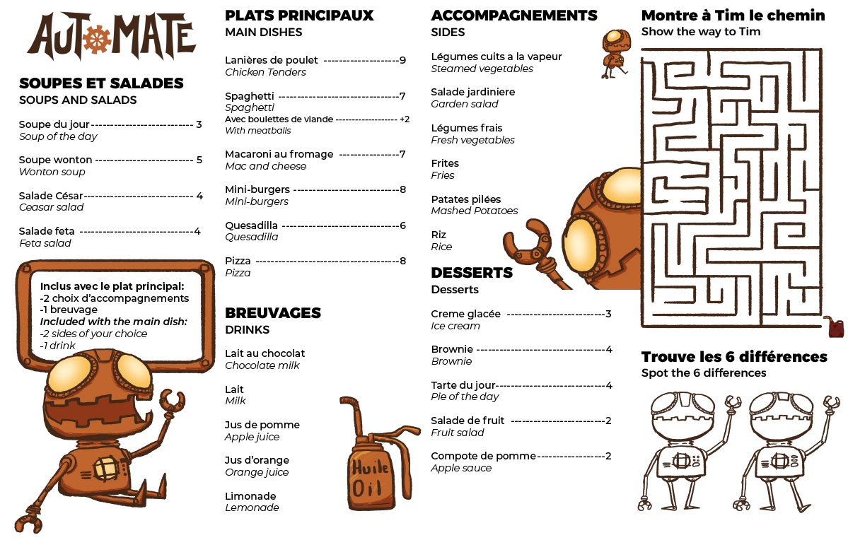
If you’d like to print one to play the games yourself, click here to download a pdf version:
7. Haskap Advertisement
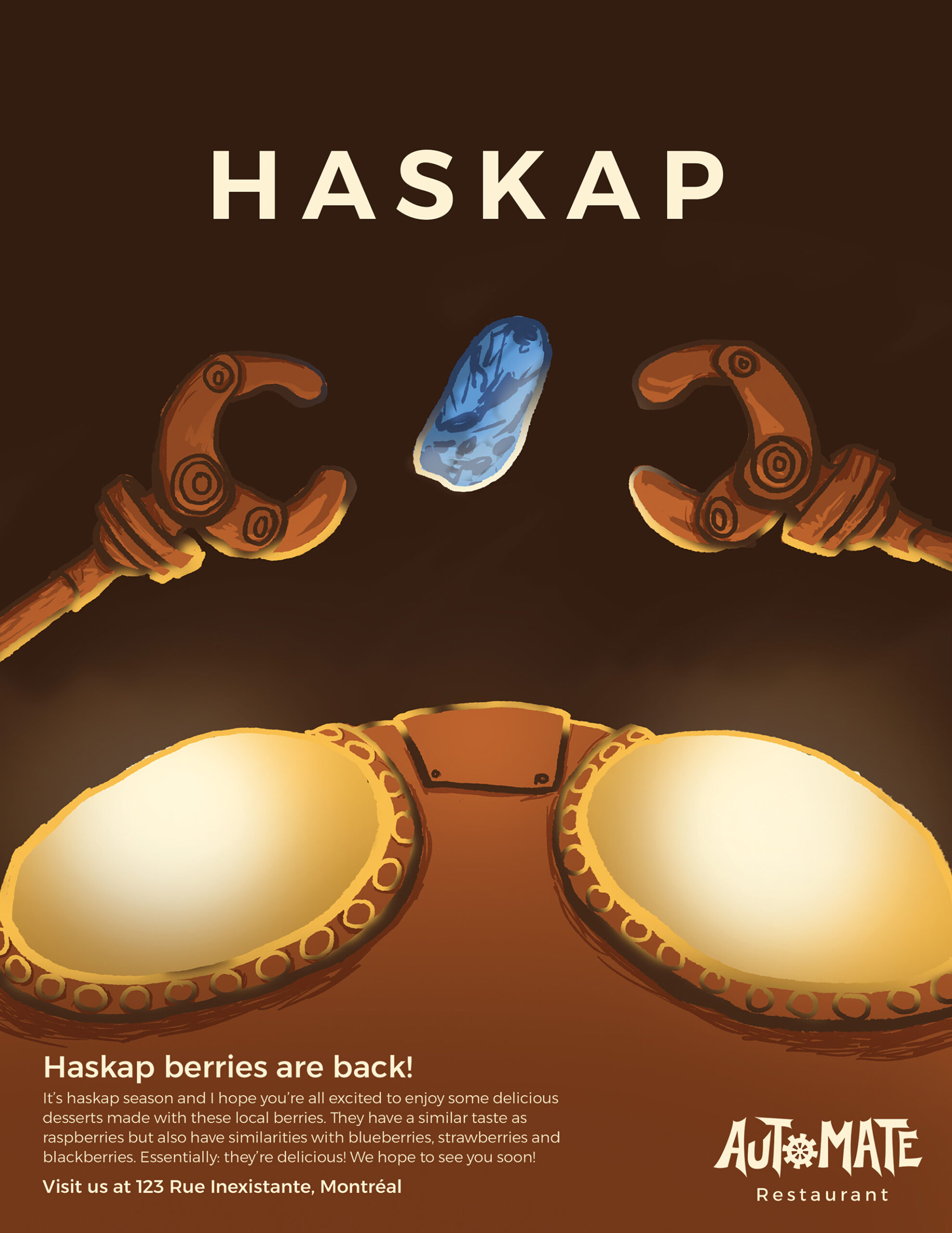
A magazine ad to bring attention to Haskap season! I thought it would be nice if Automate focused it’s menu to local foods and haskaps are a local berry. For this project I also did a rough outline in Illustrator then moved to photoshop for the drawing.
8. Website
Lastly, I made a simple website for the restaurant. I used Dreamweaver to code it all out. You can visit it by clicking here: